


On the App Store
Waiting on Apple
Outside iOS
I am always playing with new development tools and environments.
Education
have a project in mind?
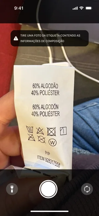
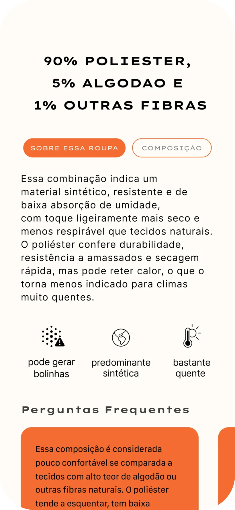
In a store, the tag already tells you the composition and almost nobody can read it.
People who want a better cost-benefit on what they buy.
The angle is an informed purchase, not sustainability and not allergies.
A team of five with no hierarchy between us.
I was in all of it: ideation, research, development, deploy, and launch.
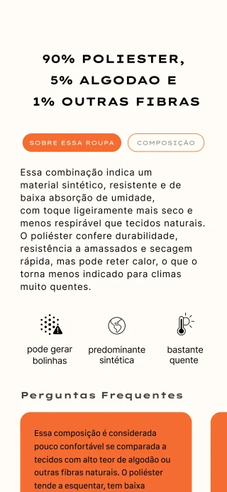
An LLM reads the composition against a limited base of known answers.
A second pass checks for hallucinations before the user sees anything.
This one started as a design exercise, not as a personal itch.
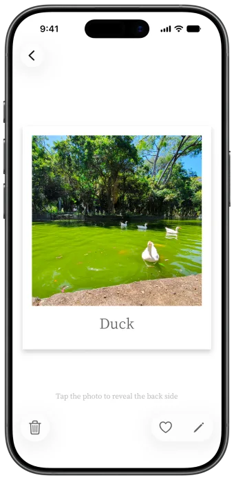
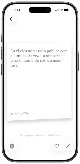
The audience was picked on purpose: narrow, calm, and always outdoors.
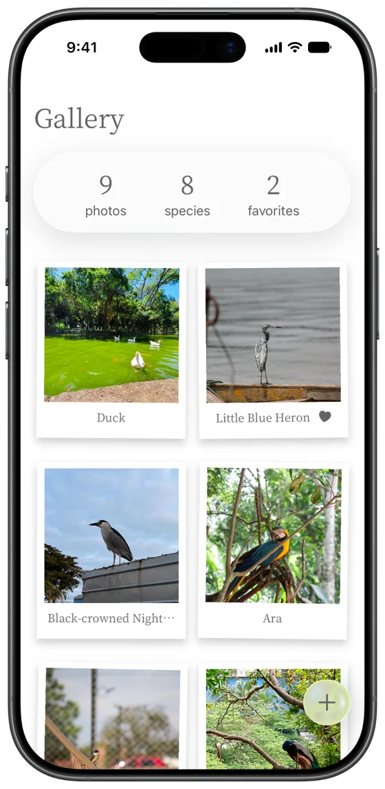
Merlin and eBird try to solve everything. This one organizes sightings and stops there.
It assumes you go out with a camera and nothing else, and fill it in when you get home.
A calm digital experience inspired by the sky.
Personal project, alone, from design to development.
One week from ideation to launch and marketing, with no idea of what to build when the week started.
The scope cut is the project: one thing, done well.
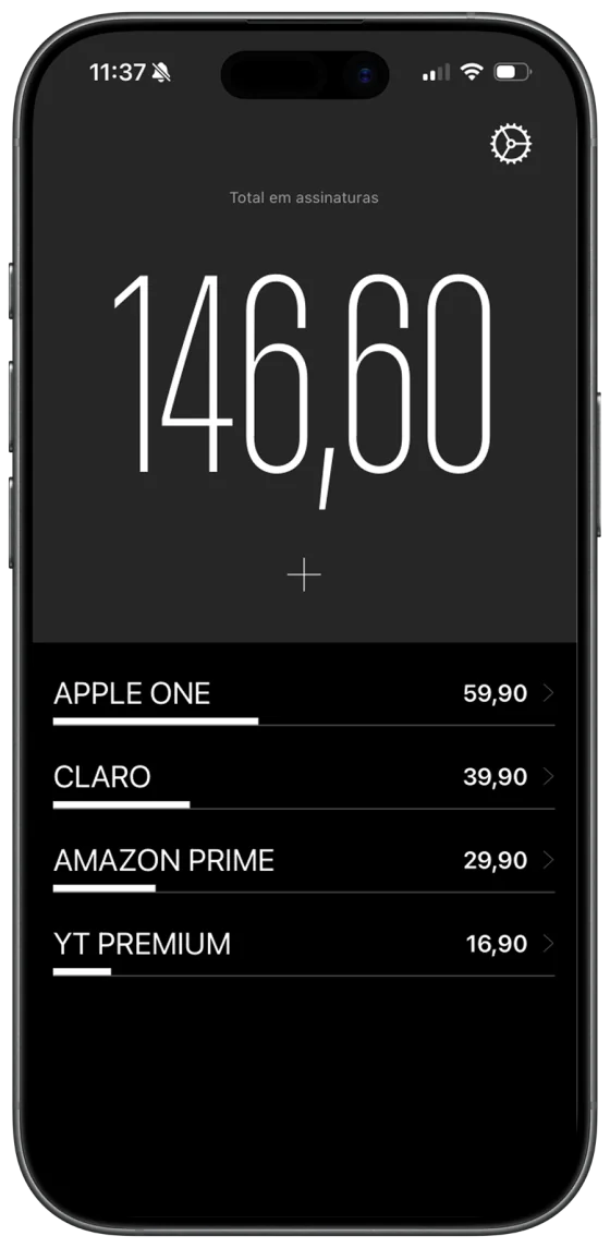
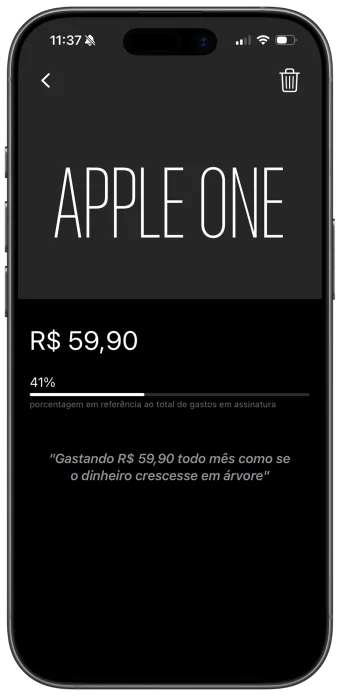
I wanted an app that only told me how much I spend on subscriptions every month.
Not the person who already tries to budget and fails.
The person who has never once looked at the number.
The app exists to make you uncomfortable about the number, not to comfort you.
Can one have a life without bullshit subscriptions?
Spend your money on what matters
Solo. I did all of it.
Manual input, on purpose: no bank connection to ask permission for.
Persistence synced through iCloud.
← back to work
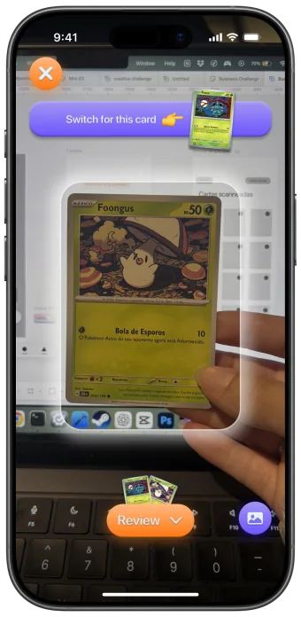
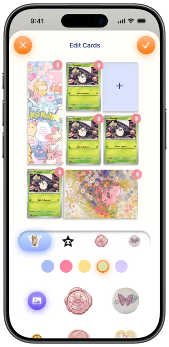
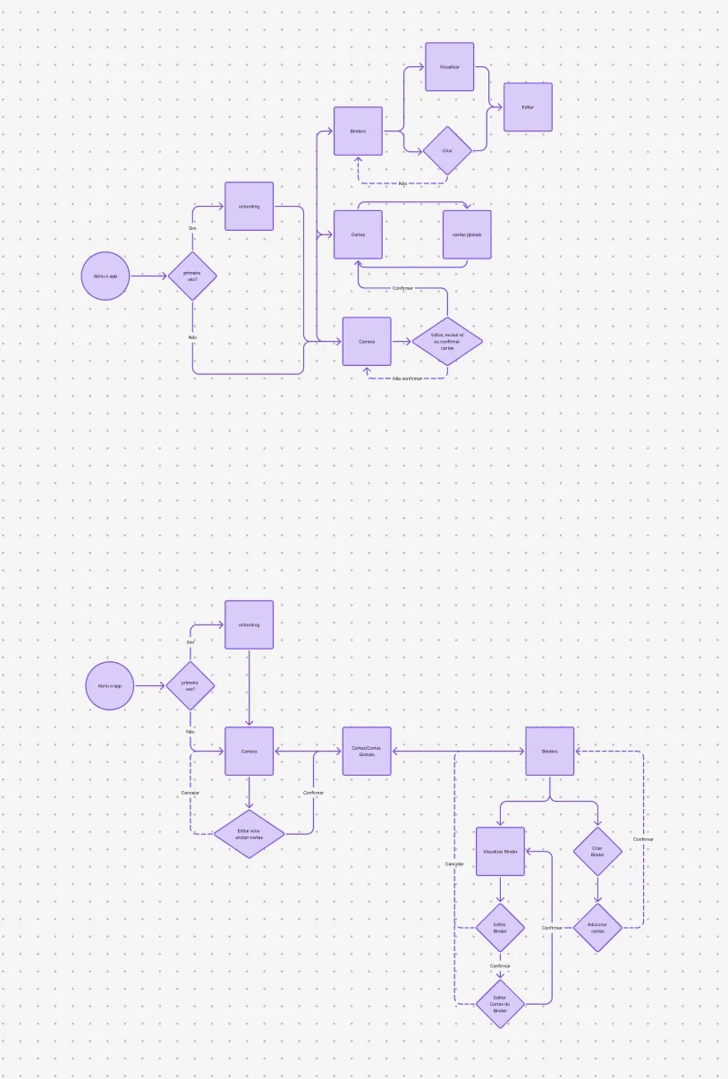
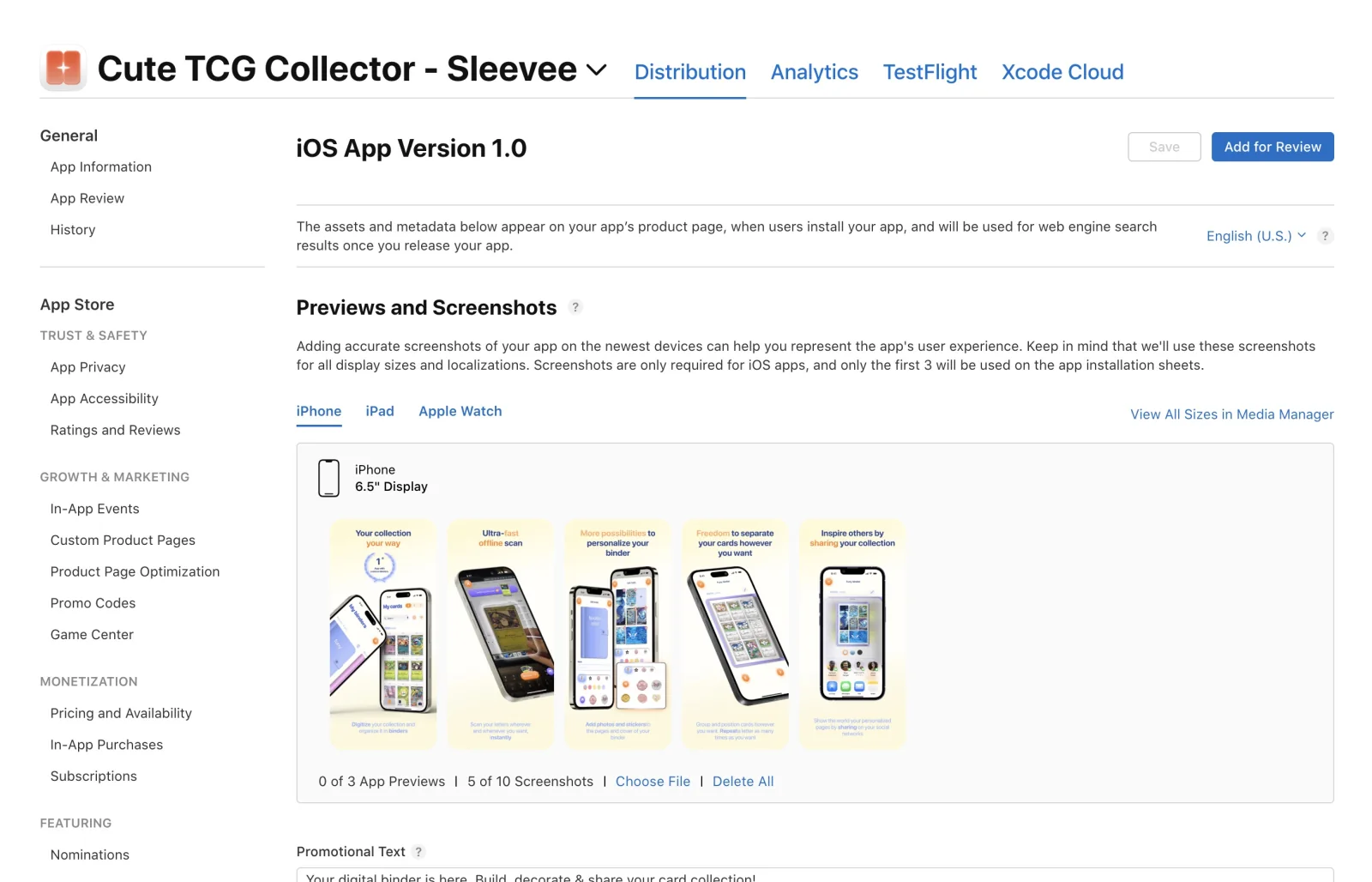
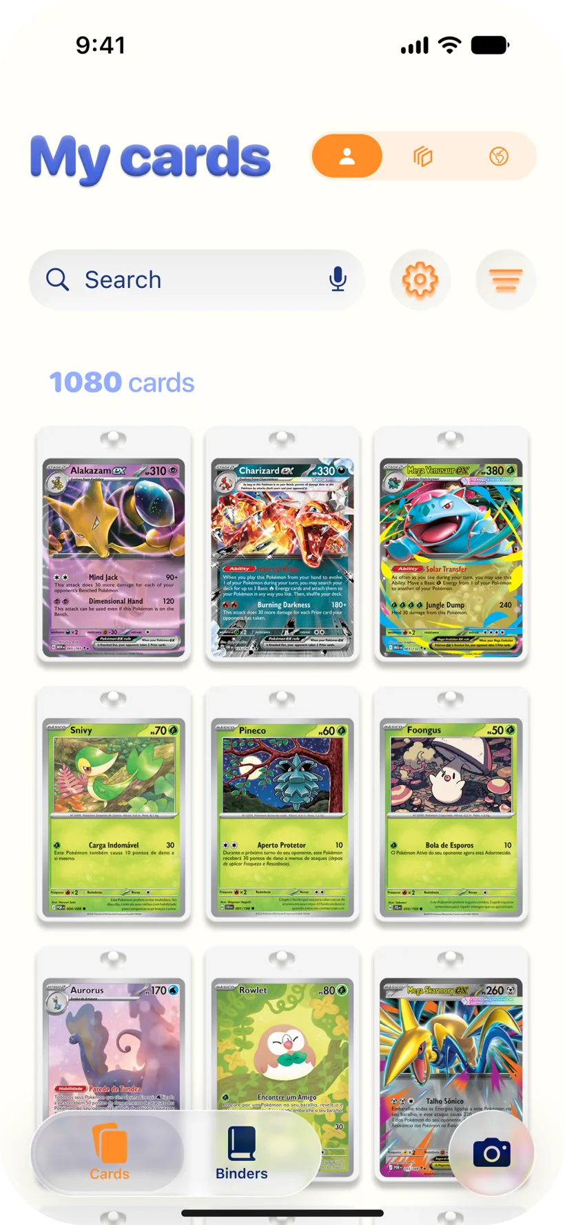
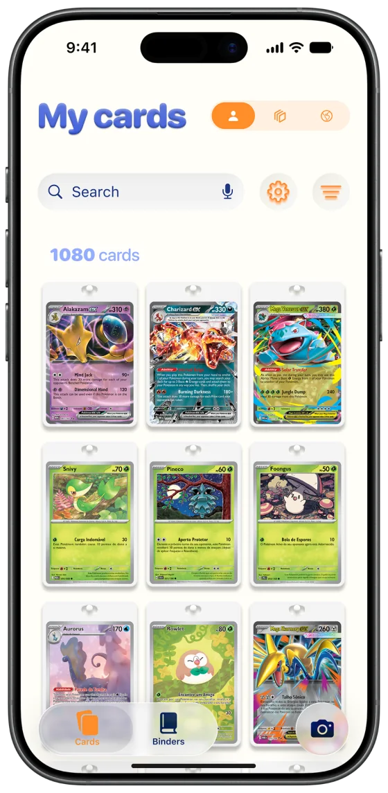
Scan, review, and organize your cards with a premium experience built for collectors.
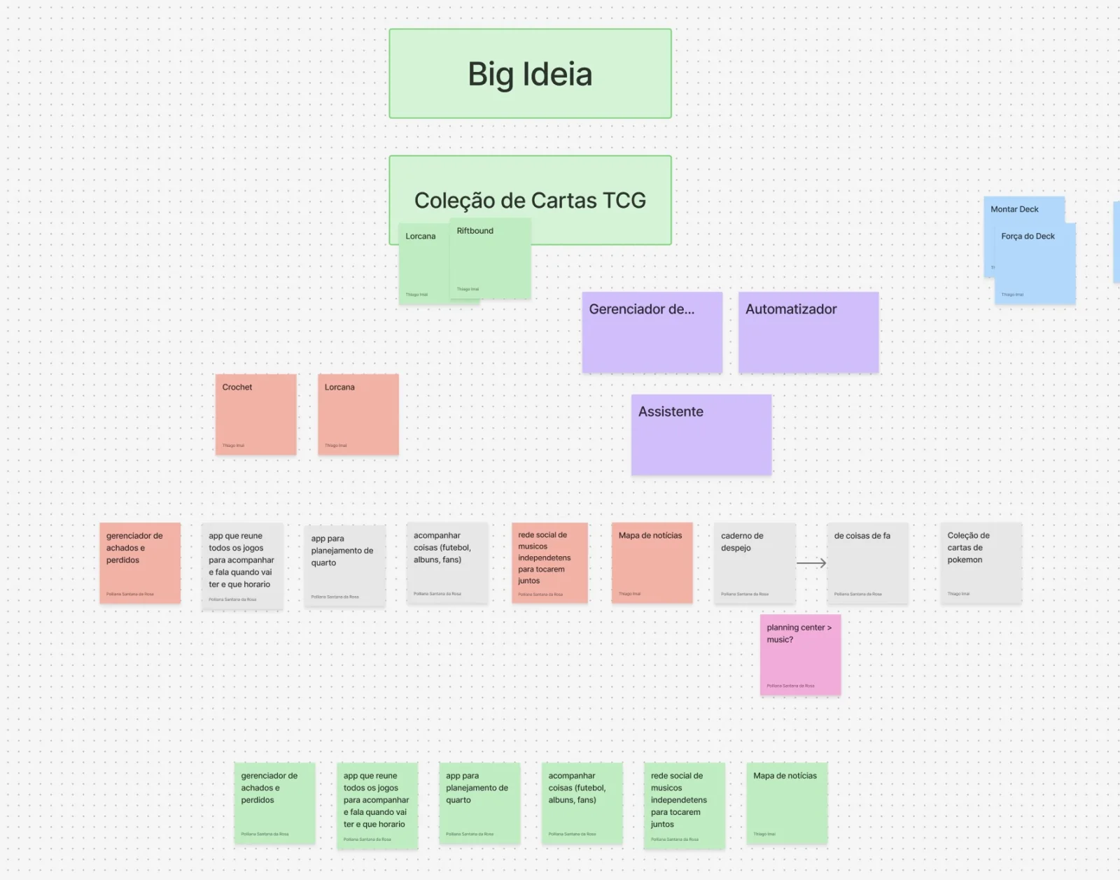
It started in market research: one keyword with heavy search and little competition.
Understanding who was searching for it opened up trading card games as a whole.
An emerging market with real money moving through it, so we bet on it.
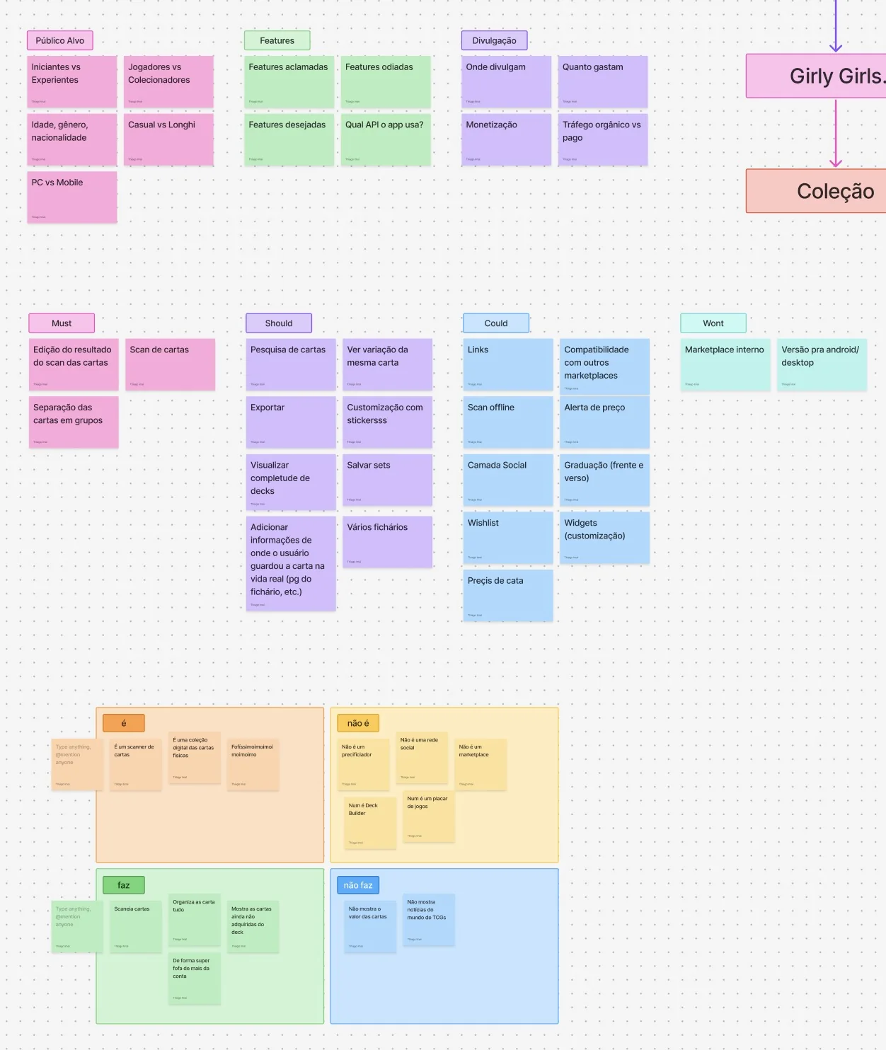
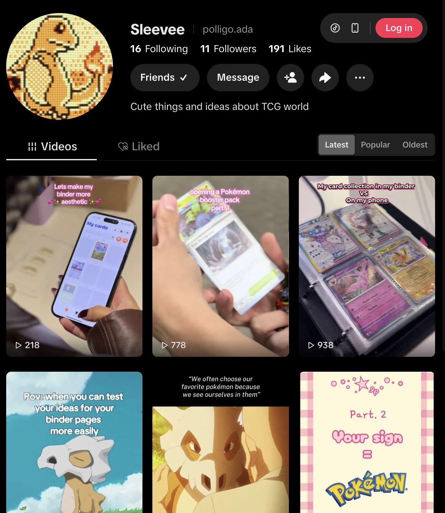
The lifestyle collector, with women on TikTok at the centre of it.
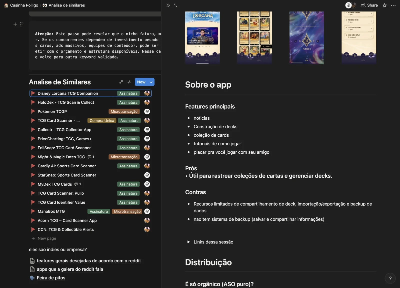
Collectr, HoloDex, Manabox and TCGBinder put data and price first.
This one puts the collection on display.
Built in a pair, equal weight in research, design, and strategy.
The code was mine.
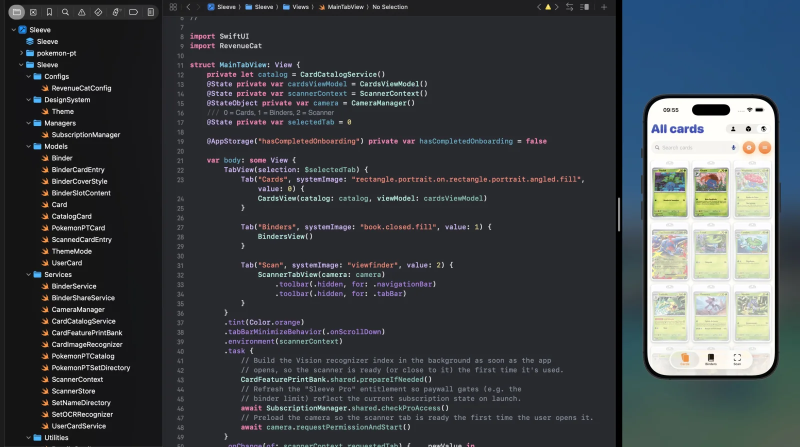
Written on the newest SwiftUI.
The card scanner runs fully offline through the Vision framework, while the rest of the category sends the image to a server.
The ideation was pinned to the market from the start. Astra, Sensor Tower, App Figures and social listening validated how contested and how open the category was before the subject was chosen.
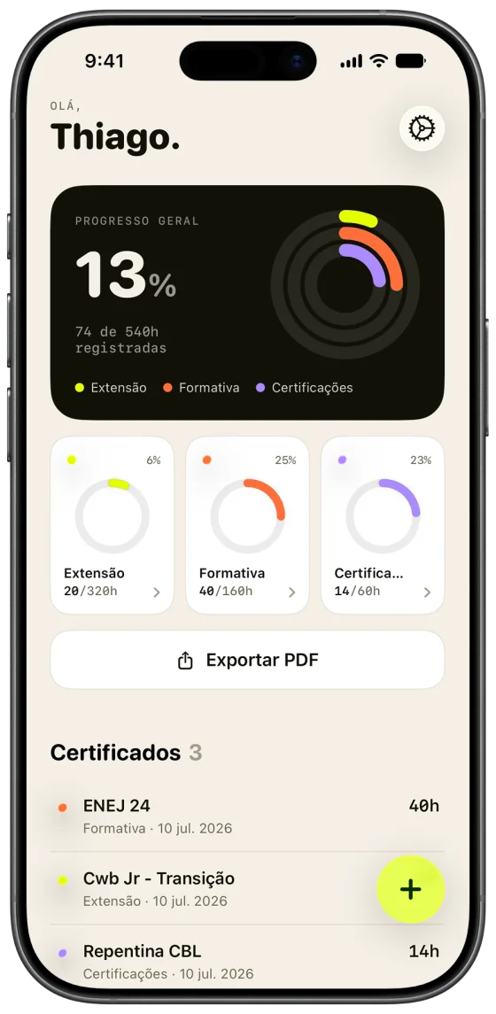
It came out of a real annoyance at university.
The reason I picked this problem is the goal behind it: learning organic marketing in practice.
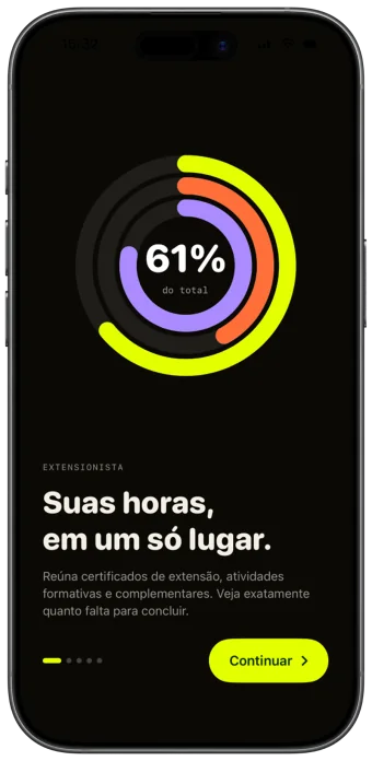
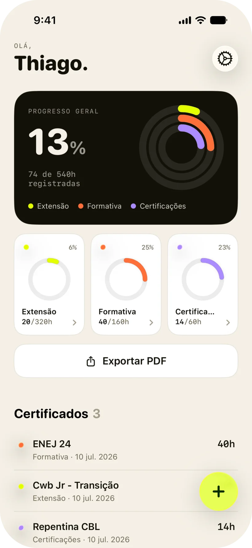
University students who have to validate extension hours to graduate.
The copy is dry on purpose, closer to dbrand than to a campus app.
Independent and alone. I did absolutely all of it.
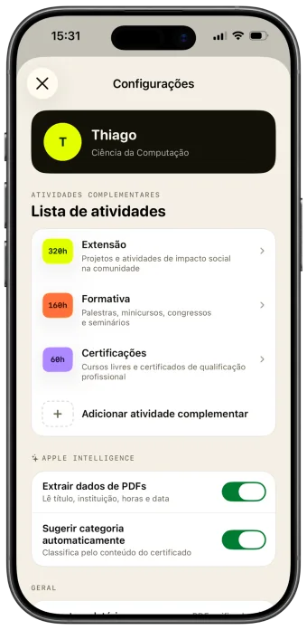
OCR reads the certificate.
Apple Intelligence looks at the activity types already in the app, decides where the new certificate belongs, and pulls the hours out of it.
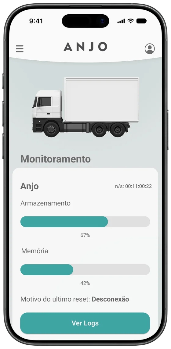
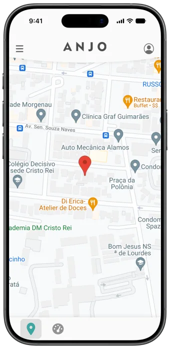
A road-safety system that keeps trucks from rolling over in curves.
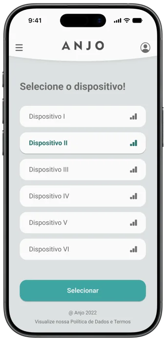
Hardware in the cab reads the road, the vehicle, and the load, and the app tells the driver the maximum safe speed before each curve.
Sold by subscription to fleets, device included.
My first internship as a developer.
I took the project alone, from zero, and shipped it in six months.
The device sends road, vehicle, and load data to the phone over BLE, so the app works with no connection at all.
The interface is built for a moving truck: big bars, big numbers, and as little navigation as possible.
Everything else here is my own product, on iOS and SwiftUI.
This one is cross-platform, talks to hardware, and carries real weight: preventing accidents, not selling a consumer app.
I no longer work at the company.
The app is still in use by the client fleets.
Not on a public store. It ships with the device, to fleets.